
Welcome to the fascinating world of data visualization! Have you ever stumbled upon a colorful chart that instantly conveyed a complex trend? Or perhaps a pie chart that made understanding a data distribution a breeze? This is the magic of data visualization, and Tableau is a powerful tool that empowers you to tell captivating stories with your data, even if you’re a complete beginner.
This comprehensive guide takes you on a step-by-step journey through creating basic charts and graphs in Tableau. We’ll explore connecting to different data sources, crafting informative bar charts, line charts, and pie charts, and finally, adding some polish to make your visualizations clear and visually appealing. So, buckle up and get ready to unlock the secrets of transforming raw data into impactful visuals!
Setting the Stage: Connecting to Your Data
Tableau thrives on data! Before we delve into creating charts, let’s explore how to connect to different data sources:
- Excel Files: A familiar friend! Tableau seamlessly connects to Excel spreadsheets (.xlsx) files stored on your computer. Simply navigate to the “Open” menu and select “Data on Computer.” Browse and choose your Excel file, and Tableau will effortlessly import your data.
- CSV Files: Comma-Separated Values (CSV) files are another popular option. Similar to Excel files, navigate to “Open” -> “Data on Computer” and select your CSV file. You might encounter a preview window where you can specify delimiters (like commas or tabs) separating your data points.
- Text Files: For plain text files with data, follow the same steps as CSV files. Ensure the data is organized with clear separators and consistent formatting.
- Databases: Tableau can connect to various databases like MySQL, PostgreSQL, or SQL Server. This requires setting up a connection using the database credentials and specifying the relevant tables or queries to access the data.
Once you’ve selected your data source, Tableau will display a preview window. Here, you can explore a glimpse of your data and even rename columns for better understanding. Finally, click “Connect” to establish the connection and bring your data into the Tableau workspace.
Charting Your Course: Exploring Basic Chart Types
Now that your data is ready, let’s dive into the exciting world of creating basic charts!
-
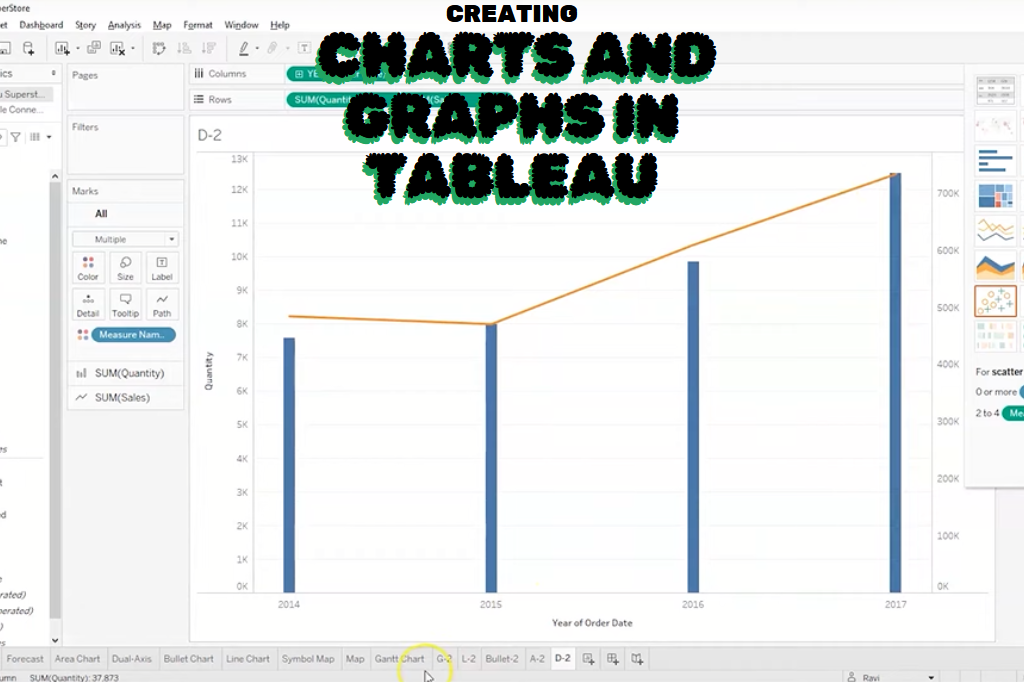
Bar Charts: These champions are ideal for comparing categories or showing how a measure varies across different categories. Imagine you have data on sales figures for different product categories. A bar chart would display each product category on the X-axis (horizontal) and the corresponding sales amount on the Y-axis (vertical). The height of each bar would visually represent the sales for that specific category.
-
Line Charts: These dynamic heroes are perfect for showcasing trends over time. Think about tracking website traffic over the course of a month. A line chart would have time on the X-axis and website visits on the Y-axis. The line connecting the data points would visually depict how website traffic fluctuates over time.
-
Pie Charts: These delightful circles are best suited for representing parts of a whole. Let’s say you have data on website traffic sources (organic search, social media, etc.). A pie chart would be perfect! Each slice of the pie would represent a specific traffic source, with the size of the slice proportional to the percentage of overall traffic it contributes.
Building Your First Chart: A Step-by-Step Guide
Let’s create a bar chart to visualize sales figures for different product categories. Here’s how:
- Drag and Drop the Magic: On the left-hand side of your Tableau workspace, you’ll find the “Data Pane.” This is where your data resides. Locate the dimension (category) you want on the X-axis (e.g., “Product Category”) and drag it to the “Columns” shelf located at the bottom of the workspace.
- Measure Up: Now, find the measure (numerical value) you want to represent on the Y-axis (e.g., “Sales”). Drag it to the “Rows” shelf located on the left side of the workspace.
- Behold! A Chart is Born: Tableau will instantly create a bar chart! Each bar represents a product category, and the bar height corresponds to the total sales for that category.
Line and Pie Charts Follow the Same Logic! Locate the relevant dimension and measure on the “Columns” and “Rows” shelves, and Tableau will generate the corresponding chart type.
Formatting for Finesse: Making Your Charts Shine
While the basic chart is functional, let’s add some polish to enhance clarity and visual appeal:
- Chart Titles: Double-click on the top center of your chart to add a descriptive title that summarizes the key takeaway of your visualization.
- Axis Labels:Click on the axis labels (X and Y) and rename them to clearly describe the data they represent.
- Data Labels: For some charts, adding data labels directly on the bars or data points can provide additional context. Right-click on a data point and select “Show Marks Labels” to display the specific values.
- Color Palette: The default color scheme might not be the most aesthetically pleasing. Click on the color legend at the bottom of your chart and explore different color palettes offered by Tableau. Choose a color scheme that aligns with your data and is visually appealing.
- Gridlines and Background: Gridlines can enhance readability, while a subtle background color can improve contrast. Access these formatting options by right-clicking on the chart background and selecting “Format.”
Pro Tip: Experiment with different formatting options to find a style that complements your data and your personal preferences.
Beyond the Basics: Exploring Additional Features
Tableau offers a treasure trove of features beyond basic charts. Here are a few to consider as you progress:
- Filters: Focus on specific data subsets by applying filters. Click on the down arrow next to a dimension on the “Columns” or “Rows” shelf and explore filtering options.
- Tooltips: Hover over a data point to reveal a tooltip displaying additional information. You can customize tooltips to show relevant details about that specific data point.
- Sorting: Rearrange the data points within your chart based on a specific dimension or measure. Right-click on a header on the “Columns” or “Rows” shelf and select “Sort.”
- Annotations: Add text boxes, shapes, or images to your chart to highlight specific data points or provide additional context.
Remember: These features are powerful tools, but use them strategically to avoid cluttering your visualizations.
Putting it All Together: A Practical Example
Imagine you’re analyzing sales data for an online store. You want to see how sales compare across different product categories and how sales have trended over the past year.
- Create a Bar Chart: Connect to your sales data and create a bar chart with “Product Category” on the X-axis and “Sales” on the Y-axis. Format the chart with a clear title, informative axis labels, and a visually appealing color scheme.
- Line Chart for Trends: Create a separate line chart with “Month” on the X-axis and “Total Sales” on the Y-axis. This will reveal how sales have fluctuated over the past year.
By combining these visualizations, you gain a holistic understanding of your sales data. The bar chart offers a snapshot of sales performance for each category, while the line chart unveils sales trends over time.
Conclusion: From Data to Insights – The Power of Visualization
Congratulations! You’ve taken your first steps into the exciting world of data visualization with Tableau. By connecting to data sources, creating basic charts, and applying formatting techniques, you’ve transformed raw data into compelling visuals that tell a story. Remember, the key is to choose the right chart type for your data and format it effectively to convey your message clearly.
As you explore further, you’ll discover a vast array of advanced features in Tableau that will allow you to create even more sophisticated visualizations. Don’t hesitate to experiment, practice, and unleash your creativity to unlock the hidden insights within your data. With Tableau as your ally, you’ll be well on your way to becoming a data visualization pro!
Feel Free To Reach out to us for tailored Help In any of these topics here at Genesis Writers

